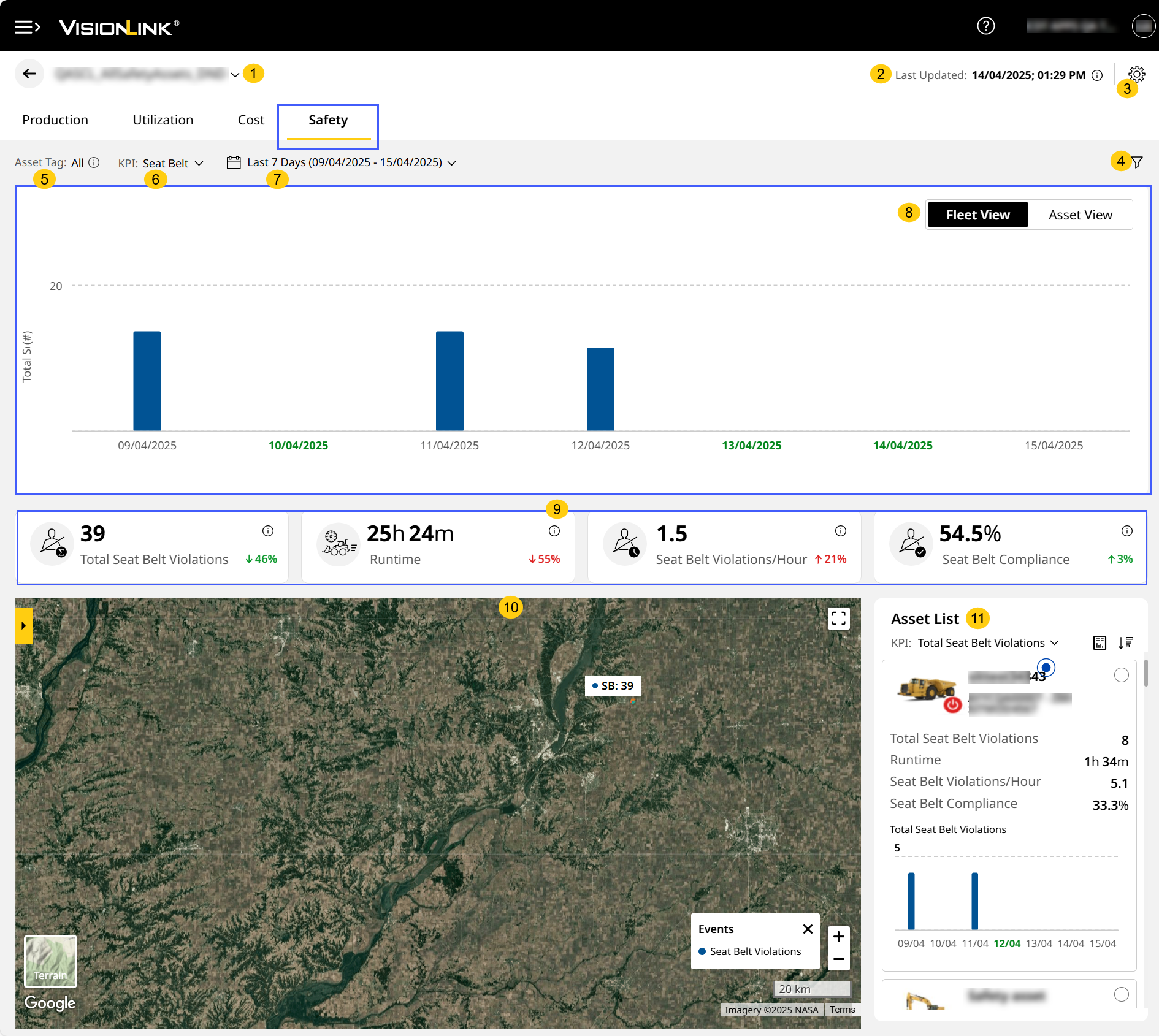
Safety (Site) Tab
When you're on Safety Dashboard, clicking any site card takes you to its respective Safety (Site).
With Safety (Site), drill-down and view detailed chart, tabular and map-wise breakdown of vital safety data. This includes seat belt and detect metrics, to understand operators’ level of compliance.
You can also
-
sort the data displayed by KPI and date range,
-
toggle between Fleet View and Asset View and
-
filter by assets operating within the site.

To know which assets support safety data and included in Safety (Site), refer to Safety Data Visibility by Subscription.

Now, access Safety (Site) using one of two ways:
• Navigate to Sites Dashboard > click Site Summary > select Safety.
• Navigate to Safety Dashboard > click Safety Summary.
Safety (Site) displays data based on preferences selected in your account settings and asset tags added during site creation.
-
Site Name: View the site name here. Use the drop down to switch sites without navigating back to Sites Dashboard.
-
Last Updated: View the timestamp of the last reported data. Click info
 to view the time zone (country/city) of the selected site.
 -
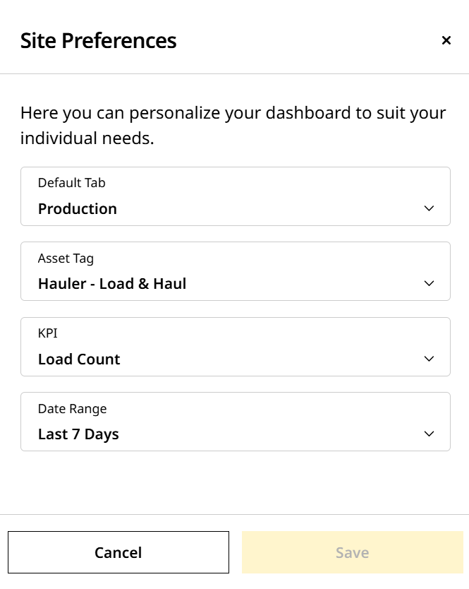
Site Preferences: Customize Site Summary to fit your needs. You can change the Default Tab, Asset Tags, KPI and Date Range.
-
Filters
 : Filter based on preferred assets and type of detected obstructions.
 -
Asset Tag: View safety data for all assets regardless of the asset tags.
Asset tags selected in Production (Site), Utilization (Site), Cost (Site) will not be carried over to Safety (Site). -
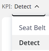
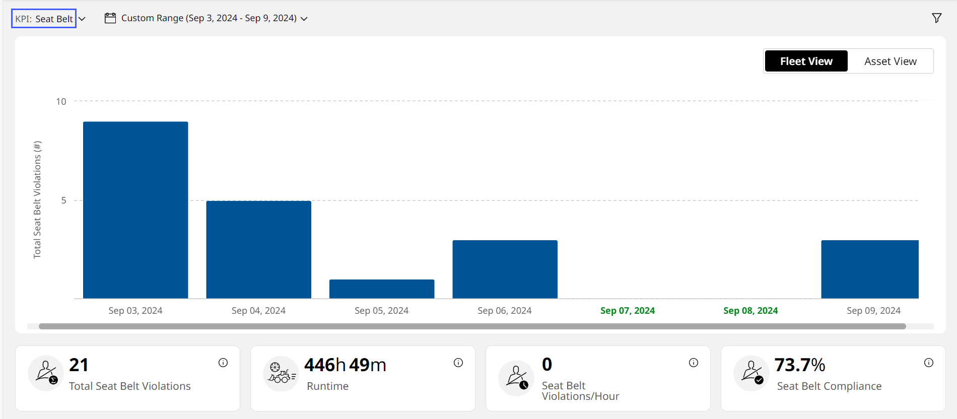
KPI: Select from the following KPIs to view corresponding chart, KPI card, tabular and map data:
-
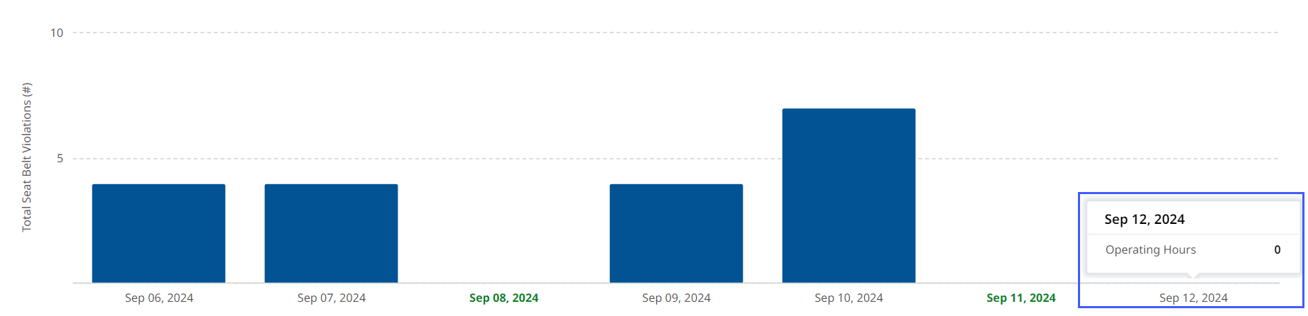
Seat Belt: Provides a total count of seat belt violations for the site’s fleet of assets or individual assets for the selected date range. Also provides compliance data from zero to 100 percentage, denoting no violation and violation respectively.
When selecting Seat Belt, the column chart and Asset List will sometimes display fleet-wise or asset-wise data in the following colors:
• Green, which indicates that the asset/fleet was operational and hasn’t reported any violation for that time period.
View ImageView Image
• Grey, which indicates that the asset/fleet wasn’t operational for that time period.
View ImageView Image
-
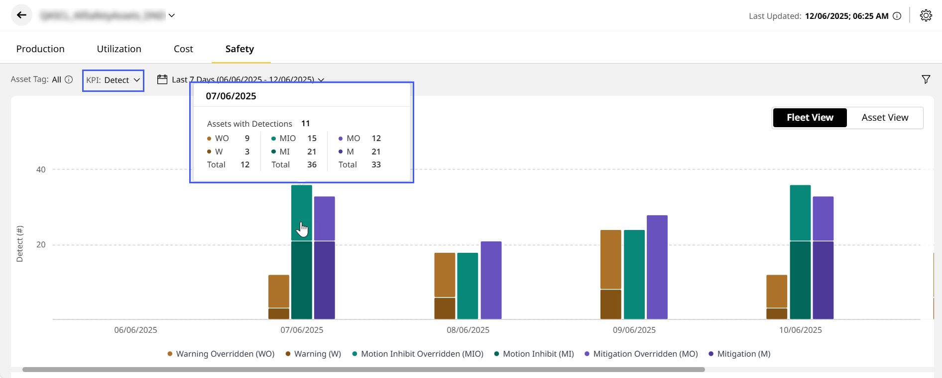
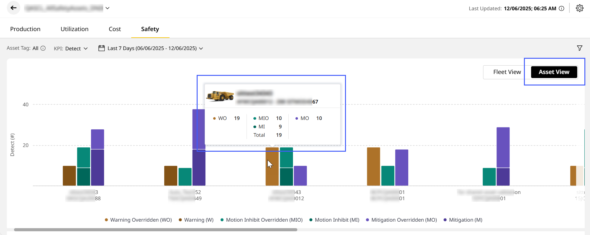
Detect: Gives total number of occurrences of the following events:
-
The asset detected a person or object in the critical (red on the display) zone while in motion.
-
A Warning, Motion Inhibit or Mitigation was triggered.
-
An operator overrode Warning, Motion Inhibit or Mitigation events (represented by the differently-colored bars).
-
-
-
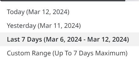
Date Range: Choose the date range to view the KPI data from the following:
-
Today
-
Yesterday
-
Last 7 Days
-
Custom Date Range: Up to seven days in one stretch from a period of 13 months.
-
-
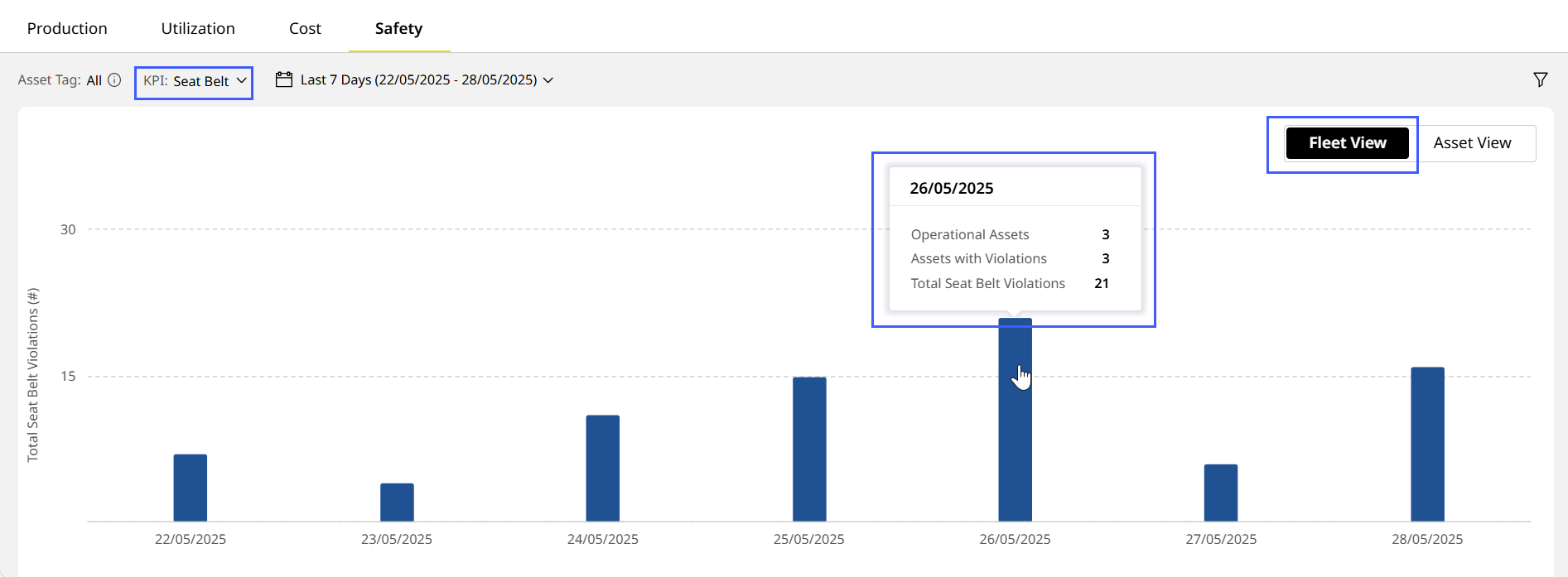
Fleet/Asset View
 : Toggle between Fleet View or Asset View, based on the selected KPI, date range and filters. This displays data in the form of bar graphs.
-
Fleet View displays safety data for the entire site, aggregating all assets together. This appears by default.
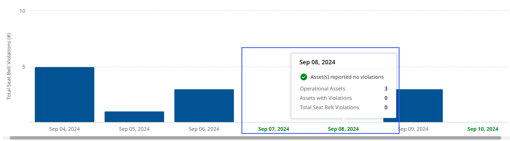
Hover over a column to view the following for the given date range:
Seat Belt Detect - Number of assets operating
- Number of assets that reported violation
- Total violations reported
View ImageView Image
- Asset count
- Number of:
- Warning Overridden
- Warning
- Motion Inhibit Overridden
- Motion Inhibit
- Mitigation Overridden
- Mitigation
-
Asset View displays safety data for each individual asset within the site.
-
Hover over a column to view the asset ID, serial number and selected KPI values for that date range.
-
-
-
KPI Cards: The following KPI cards display data based on the KPI and date range selected:
Seat Belt Detect Total Seat Belt Violations Total Detections Runtime Warning Seat Belt Violations/Hour Motion Inhibit Seat Belt Compliance Mitigation You can not only view the KPI data but also track the percentage change as one of the following:
-
Beneficial increase

-
Detrimental increase

-
Beneficial decrease

-
Detrimental decrease

The value displayed is in comparison to the prior range (single day or multiple days).
If you select Custom Date Range, then the KPI card values won't display the percentage increase or decrease . -
-
Map View: Visualize selected KPIs on the map view, alongside their asset IDs, serial numbers, and additional details.
-
Asset List: Find list of all the configured assets in the site and a brief overview of each.
• Click the asset ID to open the corresponding asset’s safety detail overview on VisionLink to view safety events details.
• Look out for red error displayed next to an asset ID if any active faults are detected in a site. Connectivity issues or failure to retrieve data are common issues.